Responsive Web Design Principles

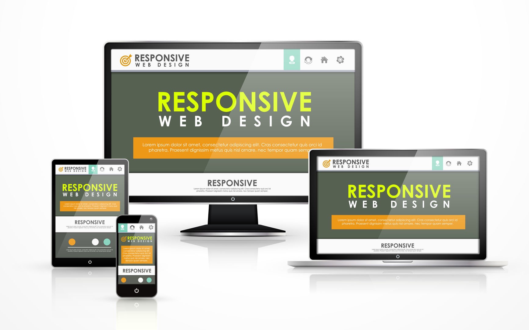
In today's world, where users access the internet on a variety of devices, responsive web design is crucial. It ensures that your website provides a great user experience across different screen sizes and devices. In this post, we'll discuss the key principles of responsive web design and how you can implement them in your projects.
Key Principles of Responsive Web Design
To create a responsive website, you need to follow these core principles:
1. Fluid Grids
Fluid grids use relative units like percentages instead of fixed units like pixels. This allows your layout to adapt to different screen sizes. For example, instead of setting a container width to 960px, you can set it to 100%, making it flexible and responsive.
2. Flexible Images
Flexible images scale within their containing element. You can achieve this by setting the max-width property to 100%, ensuring images resize appropriately within different contexts.
img {
    max-width: 100%;
    height: auto;
}
3. Media Queries
Media queries allow you to apply CSS rules based on the characteristics of the device, such as screen width. This enables you to create different layouts for different screen sizes.
@media (max-width: 768px) {
    .container {
        width: 90%;
    }
}
4. Responsive Typography
Responsive typography ensures that text scales appropriately across different devices. You can use relative units like ems or rems to achieve this.
body {
    font-size: 16px;
}

h1 {
    font-size: 2rem; /* 32px */
}
Implementing Responsive Design
Let's walk through a basic example of implementing responsive design principles in a simple webpage.
1. Basic HTML Structure
<!DOCTYPE html>
<html lang="en">
<head>
    <meta charset="UTF-8">
    <meta name="viewport" content="width=device-width, initial-scale=1.0">
    <title>Responsive Design</title>
    <link rel="stylesheet" href="styles.css">
</head>
<body>
    <header>
        <h1>Responsive Web Design</h1>
    </header>
    <main>
        <div class="container">
            <p>This is a responsive webpage.</p>
        </div>
    </main>
</body>
</html>
2. CSS for Responsive Design
body {
    font-family: Arial, sans-serif;
    line-height: 1.6;
    margin: 0;
    padding: 0;
}

header {
    background-color: #333;
    color: #fff;
    padding: 20px 0;
    text-align: center;
}

.container {
    width: 80%;
    margin: 0 auto;
    padding: 20px;
}

@media (max-width: 768px) {
    .container {
        width: 90%;
    }
}

@media (max-width: 576px) {
    header {
        padding: 10px 0;
    }

    .container {
        width: 100%;
    }
}
Conclusion
Responsive web design is essential for creating websites that work well on any device. By following the principles of fluid grids, flexible images, media queries, and responsive typography, you can build websites that provide a seamless user experience across different screen sizes. Start incorporating these principles into your projects and see the difference they make!